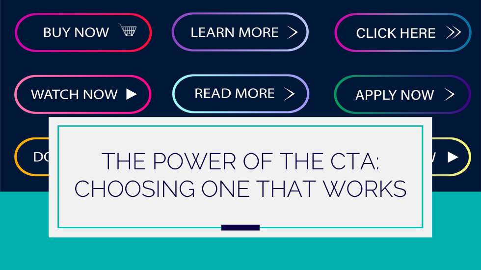
Read More, Click Here, Buy Now, Contact Us.
Sound familiar? If so, it’s because these are classic examples of a call to action, or CTA.
In marketing speak, the CTA is the section of a piece of collateral that prompts a reader to take the next step in engaging with a company or brand. These next steps might include making a call, signing up for an email, browsing a product gallery, or making a purchase or reservation.
The language and design elements that make up that prompt are collectively referred to as the CTA. Depending on the outlet, this might be a button, a link, a form, or just a line of text.
What makes a strong CTA
Research shows that small tweaks to CTA can have massive effects on click-through and conversion rates. For example, something as simple as changing the color of a CTA button has been shown to increase conversion rates by 34%.
But it’s not as simple as finding the right shape and color for a button and sticking the right words on it.
CTA strength is determined by three things: clarity about what a site visitor can get when they take a certain action, clarity about how to take that action, and a context that establishes the value of taking the action.
In other words, if a CTA isn’t working, that means that it’s either failing to make clear what the site visitor can get, failing to show how to get it, or failing to establish the value of the offer.
Context and value: beyond the button
Of these three things, the “Read More/Click Here/Contact Us” button can really only take on the first two: clarity about what a site visitor gets after taking an action and clarity about how to take the action.
The third, a context that establishes the value of taking the action, needs a little bit more space to do its work. Often, this means we’re talking about the content of a landing page.
For example, let’s consider a CTA prompting site visitors to sign up for an email newsletter.
Before evaluating the various ways of saying “Sign Up,” it’s important to ask yourself if the rest of your page has effectively established the value your reader stands to gain.
Why should people sign up for your newsletter anyway?
Is it because it’s funny, will add joy to their lives, and will give them great one-liners for all of those summer cocktail parties? If so, you’d better prove it with a million-dollar joke or two above the CTA.
Maybe there’s a 15% off coupon offered with signup, or maybe a free trial of a product or service.
If so, the page context needs to both make this fact clear and make clear that the discounted product or service is something that the reader needs. After all, 15% off of something you don’t want or need isn’t a particularly compelling deal.
CTA language
Now for the good stuff.
You’ve established the appropriate context for your CTA, making it clear that what you’re offering has value for your reader, and you want to know what to put on your button. Fair enough.
We’re writers over at FocusWorks, so we tend to come at problems from a language-first perspective. Let’s start with what you should say.
Here’s an experiment: close your eyes and think of a few CTAs you’ve seen lately. What comes to mind?
It probably wasn’t hard to think of several, and we’ll bet that versions of “Read More,” “Learn More,” and “Contact Us” were in the bunch.
So what do you think? Are these effective?
Although you might expect us to knock these familiar CTAs (after all, don’t writers hate cliché?), we’re actually going to take a different approach. These CTAs are perfectly acceptable because they effectively meet our condition number one: they make it clear what the site visitor will get if they take a certain specified action.
We actually recommend not getting too cute with your CTA language. In CTAs, as in all things, clarity is key.
Think of it like this: while a shock-value CTA like “Get Your Free Live Giraffe Today” might get you some clicks (I mean, we’re curious), it’s probably not going to get you any increased conversions.
In fact, you might even see a dip in your conversions due to decreased trust in your brand. This CTA isn’t just unclear—it’s a flat-out lie.
As we say at FocusWorks, don’t dangle the giraffes you can’t deliver.
But should you spice it up a little?
While the CTAs above are fine, you absolutely should experiment—within reason. Using creative CTA language is great if you can do so without jeopardizing clarity.
As long as it doesn’t violate our big three rules, feel free to add a little personality to your CTA. The good news is that all of the normal rules of great persuasive writing still apply within these parameters. Aim for including a concrete image, specificity, and a tone that’s appropriate for your brand.
For example,
| Instead of… | Register Now | Try… | Save My Seat |
This revision is just as clear as the original, but it’s less familiar (and therefore more memorable).
It also contains a concrete image of what the user will get from clicking on the button. Even if the seat in question is virtual, the reader can picture actually gaining a tangible benefit from registration: a seat that belongs to them, and them alone.
| Instead of… | Call Now | Try… | Give us a jingle! |
This fun, voice-y version of “Contact Us” works for a brand that wants to build customer rapport and lower barriers to entry before that first conversation.
| Instead of… | Read More | Try… | See Your Package Options |
This CTA is both more specific and more concrete than the original. While “Read More” could work as a CTA on just about any page, the revision contains more information about what you’ll specifically read about on this one.
Additionally, this CTA describes the relevant content using a concrete noun (“packages”) that already belongs to you (“your” options). It communicates that the information is relevant to the reader—and also subtly suggests that the reader might move further into the sales funnel. After all, first, you have options—then you have a choice.
CTA design principles
When it comes to getting results, CTA placement and design is just as important as language.
After all, the catchiest CTA language in the world won’t convert a single person if they can’t find it.
One recent case study demonstrated a 232% increase in conversions after a company removed “clutter” around their CTA button.
It’s common for brands to A/B test button size, color, and placement to maximize click-throughs—and because of that oh-so-important context question, different companies might see different results from those tests.
In other words, just because green was the best button color for one brand doesn’t mean that it’s the best button color generally.
That said, there are a few basic design principles that apply across the board:
- Avoid clutter. Competing text or design elements can draw your reader’s eye away from what you want to highlight. Be sure to leave some lovely white space around your CTA.
- Use contrasting colors. Your CTA should stand out. Use an accent color and make sure that there’s a high degree of contrast between the CTA, the background, and the surrounding content.
- Place strategically. Your CTA should be easy to find, but you don’t want to place it so prominently that site visitors scroll past it to get to the information they’re seeking.
A note on design, copy, and “Click Here”
There’s one CTA we won’t abide by no matter what, and that’s “Click Here.”
It’s not that it’s cliché—it’s that it’s redundant. And the shorter the copy, the more every word counts.
A CTA button that says “Click Here” is kind of like that throat-cleary nonsense we cut from our writing at FocusWorks. It’s that “From the beginning of time, humans have struggled with how to understand the relationship between SEO optimization and user experience” sentence that you might have to write just to get started, but that you should ultimately cut from your work.
What’s worse, though, is that “Click Here” takes that placeholder language and puts it right in the most important place in your copy. It’s like a long-lost lover leaning in to say “Let me tell you a secret: I am talking in your ear.”
A CTA button should be designed to be clickable.
A CTA should look clickable. In fact, a CTA should be so clickable it’s hard NOT to click it. And when something looks clickable, you don’t need to instruct people to click on it. That’s a waste of space. Instead, your copy can focus on why clicking is such a good idea.
Design and test
Finding the perfect CTA takes time, but these basic principles can improve your click-through rates and conversions—and if you’re A/B testing CTAs, they can save you time and improve your results.
Don’t believe me?
Questions about the best CTA for you? Or maybe all that text that goes around it? Drop us a line—we’re always here to help.